

Tips for Matching Art Style to Home Decor
Oct 16, 2026
Table of Contents
- Start With Your Interior Style and Design Sensibility
- Matching Wall Art to Room Colors and Palette
- Understanding Scale, Proportion, and How to Style Artwork on a Wall
- Artwork Size and Placement Above Furniture
- Creating a Gallery Wall: Layout Ideas and Arrangement
- Balancing Contrast and Cohesion in Your Space
- Practical Considerations: Medium, Lighting, and Budget
- Frequently Asked Questions
Last Updated: October 15, 2026
Start With Your Interior Style and Design Sensibility
Your home's interior style is the foundation for choosing art that belongs on your walls, and understanding tips for matching art style to home decor will help you make confident decisions. Before you buy anything, understand what design sensibility already exists in your space.
Look at your furniture, flooring, and existing decor. Are your pieces modern and minimal? Traditional and ornate? Eclectic and layered? The art you choose should either echo this sensibility or intentionally contrast with it, but that choice must be deliberate, not accidental.
Collectors often make one common mistake: they fall in love with a piece without asking whether it fits their home's existing language. A bold abstract canvas might be stunning on its own. But if your space is all soft, traditional furnishings, that piece will feel like it landed from another world.

Start by naming your style. Here are the main categories:
- Modern/Contemporary: Clean lines, minimal ornament, neutral palettes, geometric shapes
- Traditional: Ornate frames, classic subjects, rich colors, formal arrangements
- Eclectic: Mixed periods, layered textures, bold color, collected-over-time feel
- Minimalist: Lots of white space, single focal points, restrained color
- Bohemian: Layered patterns, warm earth tones, global influences, artistic chaos
- Coastal: Light colors, natural materials, seascapes or nature themes, relaxed feel
Once you name your style, you have a filter. Does the artwork you're considering fit? If not, can you explain why the contrast works?
This step prevents buyer's remorse. You're not just picking art, you're picking art that belongs in YOUR home.
Matching Wall Art to Room Colors and Palette
Color is where most matching decisions happen. The right artwork can tie a room together. The wrong one will feel like it's fighting everything else.
Start by identifying your room's color palette. Look at your walls, furniture, and dominant textiles. Most rooms have three to five main colors. Write them down.
Now look at the artwork you're considering. Does it contain at least one of those colors? If yes, you have a match. The piece will feel connected to the room.
Here's where it gets interesting: you can also use art to introduce a new accent color. A room might be mostly neutral with navy and cream.
Consider lighting as well. Natural light changes how colors appear. A piece that looks warm and golden in gallery lighting might appear cooler in your north-facing living room. If possible, see artwork samples in your actual space before committing.
Many collectors find that matching artwork to room colors is less about exact matches and more about harmony. A piece with similar color temperature (warm or cool) to your existing palette will feel cohesive even if the specific hues differ.
Understanding Scale, Proportion, and How to Style Artwork on a Wall
Scale is the relationship between the artwork and the wall. Proportion is how the artwork relates to furniture and the room overall.
Get the scale wrong, and even beautiful art looks awkward. Get it right, and the room feels intentional.
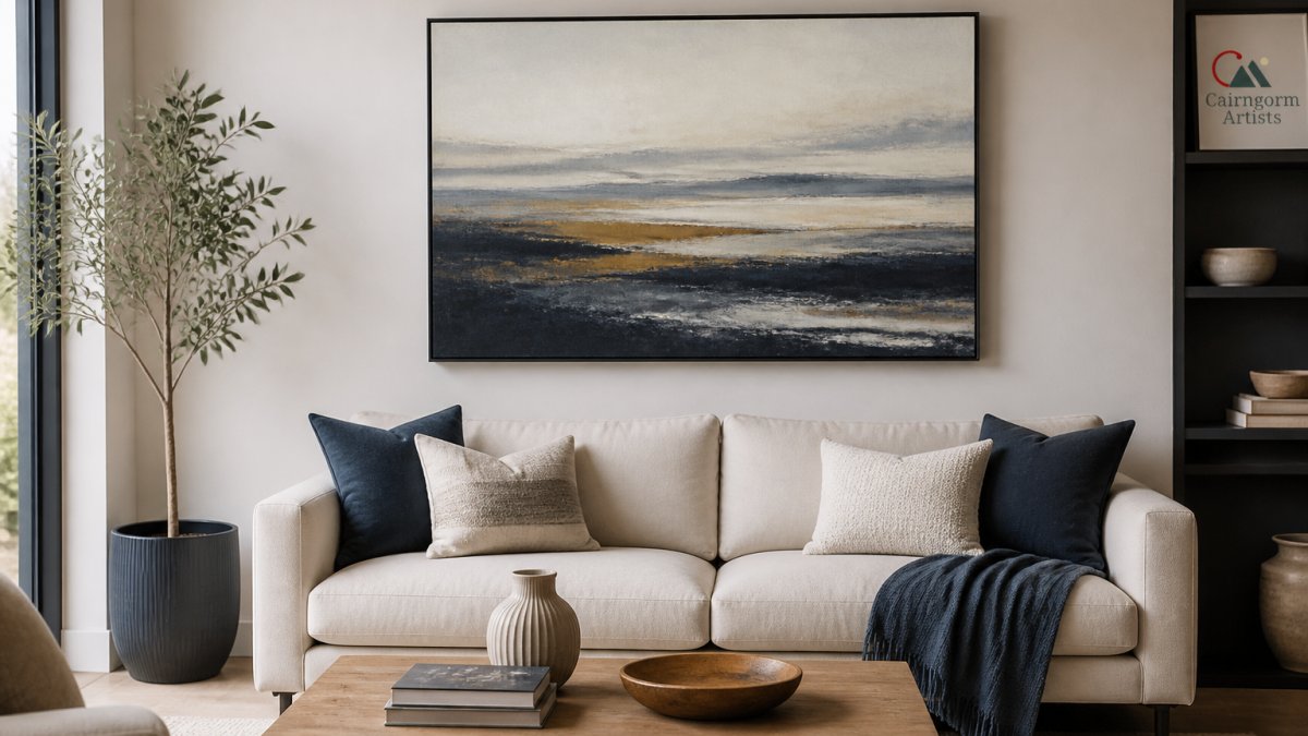
The basic rule: Artwork should occupy 50 to 80 percent of the wall space above furniture. If your sofa is four feet wide, the artwork should be three to three-and-a-half feet wide. This creates visual balance. Too small and the piece disappears. Too large and it overwhelms.
For a statement piece above a sofa, aim for the artwork to be slightly narrower than the furniture below it. This creates stability. A piece that's much wider than the sofa will feel top-heavy.
Proportion also matters in the room itself. A small 16-by-20-inch print gets lost in a large bedroom. A 48-by-36-inch canvas might dominate a small guest room. Consider the room's square footage and ceiling height.
Here's a practical approach:
- Measure the wall space where you want to hang art
- Measure the furniture below or near it
- Calculate 50 to 80 percent of that furniture width
- Use painter's tape to outline that size on your wall
- Step back and see how it feels
This takes five minutes and prevents expensive mistakes.
Artwork Size and Placement Above Furniture
Placement above furniture follows one key principle: the artwork should sit between eye level and slightly above it when you're standing in the room.
Eye level is typically 57 to 60 inches from the floor to the center of the artwork. This is where the human eye naturally focuses. Hang art here and it feels intentional and welcoming.
If you're hanging art above a sofa, leave 8 to 12 inches of space between the top of the furniture and the bottom of the frame. This gap creates breathing room. Too close and the pieces feel cramped. Too far and they disconnect.
For artwork above a console table or dresser, the same rule applies. The gap matters. It's the difference between a carefully styled space and one that feels haphazard.
When multiple pieces hang together above one furniture item, treat them as a group. The group's center should be at eye level, not each individual piece.
Consider the room's traffic patterns too. If people walk past the wall frequently, hang art at standard eye level. If the wall is mostly viewed from a seated position (like above a sofa), you can hang slightly lower, around 55 inches.
Creating a Gallery Wall: Layout Ideas and Arrangement
A gallery wall is a group of artworks arranged together. It's one of the most flexible ways to display art because you can mix sizes, frames, and styles.
The first decision: symmetrical or asymmetrical layout?
Storm over Glencoe - canvas print from original abstract art →
Symmetrical layouts are formal and calm. You arrange pieces in a grid, three across, three down. All frames match or coordinate. This works well in traditional or minimalist spaces.
Asymmetrical layouts are dynamic and collected-looking. You vary frame sizes, spacing, and arrangement. Pieces don't line up in perfect rows. This suits eclectic or bohemian spaces.
Here's how to plan a gallery wall:
- Lay all pieces on the floor in your chosen arrangement
- Use painter's tape to outline each frame on the wall
- Step back and look from different angles
- Adjust until spacing feels balanced
- Mark nail holes and hang
For spacing, aim for 2 to 3 inches between frames. This creates visual connection without crowding. Consistent spacing looks intentional. Varied spacing can work if you're deliberately creating an organic, collected feel.
Mixing frame styles works when there's a unifying element, all wood frames, all black frames, or all mismatched frames in a cohesive color range. Mixing frames without a theme looks chaotic.
Consider the wall's proportion to your gallery. A 10-by-8-foot wall can handle a large gallery. A small bedroom wall might work better with three to five pieces rather than twelve.
| Layout Type | Best For | Frame Style | Spacing |
|---|---|---|---|
| Symmetrical Grid | Traditional, Minimalist | Matching | Consistent 2-3 inches |
| Asymmetrical | Eclectic, Bohemian | Mixed or Matching | Varied or Consistent |
| Linear Row | Modern, Hallways | Matching | Consistent |
| Salon Style | Collected, Artistic | Mixed | Varied |
Balancing Contrast and Cohesion in Your Space
The real art of matching artwork to home decor is knowing when to contrast and when to match, which is why tips for matching art style to home decor focus on intentional choices.
Contrast creates interest. A bold, colorful abstract piece in a neutral room draws the eye. It becomes a focal point.
Cohesion creates harmony. Artwork that echoes your existing colors and style feels like it was always meant to be there. The room feels complete and thoughtful.
The best spaces usually have both. A room that's entirely cohesive can feel boring. A room with random contrast feels chaotic.
Here's the balance: use cohesion as your baseline. The artwork should have at least one element that connects to your existing decor, a color, a style, a mood.
For example, a room with traditional furniture and warm wood tones might feature a contemporary abstract landscape. The warm earth tones create cohesion. The abstract style creates contrast. Together, they make the space feel curated rather than decorated.
This approach also works across multiple pieces. In a gallery wall, you might have mostly traditional pieces with one modern print. The mix creates visual interest while maintaining overall coherence.
Practical Considerations: Medium, Lighting, and Budget
Beyond style and color, three practical factors shape your artwork choices: medium, lighting, and budget.
Medium, the material of the artwork, affects how it looks and lasts. Canvas prints have texture and warmth.
Consider your room's environment. A kitchen or bathroom with humidity needs a durable medium. Canvas and sealed prints handle moisture better than unframed paper.
Lighting shapes how artwork appears every day. North-facing walls get cool, indirect light, perfect for pieces with subtle color gradients.
If you're unsure, ask to see samples in your actual space. Many galleries and retailers allow this.
Budget determines what's realistic. Original paintings cost more than prints. Framing adds significant expense. Shipping and installation add more. Set a budget before you start looking.
Many collectors start with prints or canvas pieces to test what works in their space. Once you know your preferences, you can invest in original artwork.
Cairngorm Artists offers canvas prints and fine art paper prints, with prices ranging from £31 to £58 for prints and canvas pieces.
Matching artwork to your home is a skill you develop through intention and practice. Start by understanding your interior style and color palette.
At Cairngorm Artists, we create original artwork inspired by the Scottish Highlands, landscapes and wildlife captured with authentic brushwork and emotion. Whether you're drawn to bold abstracts like Storm over Glencoe canvas print or delicate florals, our collective of ten Highland artists creates work designed to bring meaning to your walls.

Frequently Asked Questions
How do I know if artwork will actually look good in my home before buying?
Measure your wall space and note the dominant colors, lighting, and furniture arrangement. Compare these against product photos and descriptions carefully. Many collectors photograph their walls and use digital mockup tools or apps to visualize pieces in their space before purchase. Cairngorm Artists pieces arrive ready to hang with a safe-arrival promise, so you can display them immediately and return within a reasonable timeframe if they don't suit your space, though most buyers find the artwork transforms their room once it's properly placed and lit.
Does art have to match the room's decor, or can I use contrast?
Art can work either way. Matching creates cohesion and a polished look, while contrast makes a statement piece that becomes a focal point. The key is intentionality: if you're contrasting, choose artwork with at least one color or theme that echoes elsewhere in the room so it feels connected rather than out of place. Abstract pieces like Storm over Glencoe work beautifully as statement art because their layered colors and mood can anchor a room while complementing multiple design styles.
What is the right size for artwork above a sofa or bed?
A good rule is to choose artwork that covers 50-80% of the furniture's surface width. For a standard sofa (around 200 cm wide), select a single piece or gallery arrangement between 120-160 cm wide. Above a bed, aim for artwork that spans roughly two-thirds of the headboard width. Leave 15-30 cm of space between the top of the furniture and the bottom of the artwork for visual breathing room. This creates visual balance without overwhelming the space.
How do I arrange multiple pieces or create a gallery wall layout?
Start by laying all pieces on the floor to plan your arrangement before hanging. Use paper templates or chalk outlines on the wall to visualize spacing. Maintain consistent gaps (10-15 cm) between frames for a cohesive look. Mix frame styles, sizes, and orientations for visual interest, but keep a unifying element, such as a color palette, theme, or frame finish, to tie the arrangement together. Odd numbers of pieces (3, 5, 7) often feel more balanced than even numbers.


