

How to Visualize Original Art in Your Home
Aug 17, 2026
Table of Contents
- Why Visualizing Original Art Before You Hang It Matters
- Best Apps to Visualize Art on Walls
- Art Placement Rules for Interior Design
- How to Hang Original Landscape Paintings
- Gallery Wall Arrangements and Focal Point Composition
- Budget-Friendly Framing and Matting Hacks
- How to Visualize Original Art: Bringing It All Together
- Conclusion
Last Updated: August 17, 2026
Why Visualizing Original Art Before You Hang It Matters
Knowing how to visualize original art in your home before committing to a nail is one of the most underrated skills in interior styling. At Cairngorm Artists, we hear the same concern from collectors regularly: "What if it looks completely different in my space than it does on screen?" The gap between imagining art and actually seeing it in context is where most decorating mistakes happen. A landscape painting that feels intimate in a product photograph can overwhelm a small alcove or disappear on a double-height wall.
Getting this right before you hang means fewer regrets, better placement decisions, and a result that genuinely transforms a room. Original artworks are investments, and moving them repeatedly risks damage to both the piece and your walls. Visualization tools, planning techniques, and a basic understanding of placement rules let you commit with confidence the first time.
Below, we'll cover everything from augmented reality apps to the 57-inch hanging rule, gallery wall composition, lighting choices, and budget-friendly framing hacks.
Best Apps to Visualize Art on Walls
The fastest way to visualize original art in a room is to use your smartphone. Several apps now make it possible to preview artwork in your actual space before you buy or hang anything, using your phone's camera and AR technology.
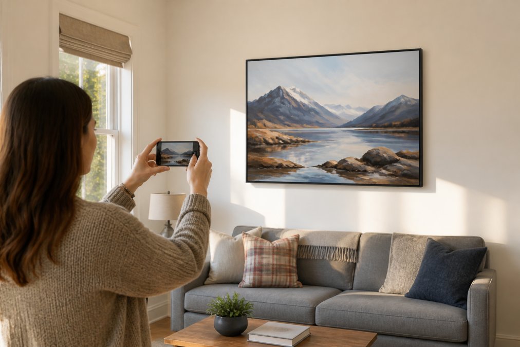
A person holding a smartphone up toward a bright living room wall, using an AR app to preview a large framed landscape painting hovering in position above a grey linen sofa, warm afternoon light coming through a side window
Augmented Reality Apps Worth Trying
Augmented reality apps overlay a digital image of artwork onto a live camera feed of your room, giving a surprisingly accurate preview of how a piece will sit in your space, including its scale relative to your furniture and wall dimensions.
Apps worth exploring include curated AR viewers built into online gallery platforms, general room planning apps from major furniture retailers that allow you to upload custom artwork images, and even your camera app itself, simply hold a printed or screen-displayed image of the artwork at arm's length in front of your wall for a rough but useful sense of scale.
The key limitation of AR apps is colour accuracy. Screen calibration varies, so treat the preview as a scale and proportion guide rather than a definitive colour reference.
Low-Tech Alternatives: Paper Templates and Digital Mockups
The oldest trick in interior design remains one of the best: cut kraft paper or newspaper to the exact dimensions of the artwork, tape it to your wall, and live with it for a day or two. This method tells you things an app cannot, how the placement feels at different times of day, how it interacts with changing natural light, and whether the visual weight feels right from across the room.
Digital mockups are a middle ground. Take a photograph of your wall on a neutral day with consistent lighting, then use free photo editing tools to drop in a scaled image of the artwork. It takes about ten minutes and gives you a shareable image for a second opinion.
According to guidance from the Victoria and Albert Museum on displaying art at home, living with a piece in its intended position, even as a paper stand-in, is one of the most effective ways to confirm a placement decision before committing.
Art Placement Rules for Interior Design
Art placement rules encode decades of collective visual experience into simple, repeatable guidelines. Understanding them before breaking them is key to avoiding a painting that floats awkwardly above a sofa or crowds a doorway.
The 57-Inch Rule and Eye-Level Hanging
The 57-inch rule is the single most useful guideline in art placement: hang the centre of your artwork 57 inches (approximately 145 centimetres) from the floor. This corresponds to average human eye level and is the standard used by most professional galleries worldwide.
In practice:
- Measure 57 inches up from the floor and mark it lightly in pencil
- Measure the height of your artwork and divide by two to find its centre
- Subtract the distance from the top of the frame to the hanging hardware
- That final number, added to your 57-inch mark, gives you the nail position
Adjust upward by a few inches in rooms with very high ceilings or consistently taller furniture.
Proportion, Scale, and Visual Weight
Scale is the relationship between the artwork and the wall, and between the artwork and the furniture beneath it. A piece should occupy roughly two-thirds to three-quarters of the width of the furniture it sits above. Smaller than that and it looks lost; wider and it dominates awkwardly.
Visual weight is subtler. A dark, densely painted landscape carries more visual weight than a light, airy watercolour of the same dimensions. Heavier pieces benefit from being slightly lower on the wall, which grounds them visually. Lighter works can sit a touch higher without feeling unmoored.
Negative space matters too. Art needs breathing room, at least 15-20 centimetres of clear wall on either side.
How to Hang Original Landscape Paintings
Original landscape paintings present specific hanging considerations that prints do not. The texture of the paint surface, the weight of the canvas or board, and the way light interacts with brushwork all affect placement.
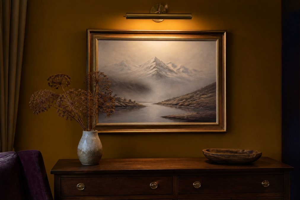
A framed original landscape painting of a misty loch and snow-capped mountains hanging on a warm ochre wall above a dark wooden sideboard, lit by a small brass picture light mounted above the frame, with a ceramic vase and dried botanicals arranged below
Rental-Friendly and Damage-Free Hanging Methods
Modern damage-free hanging solutions have become genuinely reliable for works up to a certain weight. Adhesive strips rated for picture hanging can support many framed prints and lighter original paintings. For heavier originals on stretched canvas or board, a French cleat system distributes weight across a broader wall area and can be installed with minimal fixings. Picture rails, where present in older properties, are ideal and require no new holes.
For renters:
- Check your tenancy agreement for restrictions on wall fixings before hanging anything
- Use adhesive strips rated for the artwork's weight, following manufacturer instructions precisely
- For heavier pieces, request permission to install a single picture hook rather than multiple smaller fixings
- Document wall condition with photographs before and after installation
As the UK's National Trust guidance on hanging art in historic properties notes, distributing weight evenly and avoiding direct contact with masonry surfaces protects both the artwork and the wall surface over time.
Lighting Your Landscape Art: Sconces, Picture Lights, and Natural Light
Lighting transforms how a landscape painting reads in a room. The wrong light flattens it; the right light makes the brushwork come alive.
Picture lights mounted directly above the frame direct light across the surface, revealing texture and depth. Brass or black finishes suit traditional frames; brushed nickel works with contemporary styles.
Sconces placed on either side of a painting create a theatrical effect, working particularly well for large-scale works or paintings positioned as a room's centrepiece.
Natural light is often overlooked. A landscape painting hung opposite a north-facing window receives consistent, cool daylight that suits works with subtle tonal variation. South-facing rooms bring warmer, more variable light that suits bolder paintings.
Avoid direct sunlight on original paintings, UV exposure causes pigment fading over time. If a wall receives direct sun, use UV-filtering glass or acrylic in the frame.
Gallery Wall Arrangements and Focal Point Composition
A gallery wall creates a focal point that anchors a room and tells a visual story. The distinction between success and failure comes down to curation and composition.
Symmetry vs Asymmetry: Choosing Your Layout
Symmetrical gallery walls use matching or mirrored arrangements around a central axis. They feel formal, considered, and calm, suiting hallways, dining rooms, and traditional architecture. The risk is rigidity.
Asymmetrical layouts are harder to plan but more dynamic. They allow mixing sizes, orientations, and frame styles in a way that feels collected rather than curated. The key is visual balance, not mirror balance. A large dark painting on one side can be balanced by three smaller lighter pieces on the other.
A useful planning method: lay all your pieces on the floor and experiment with arrangements before touching the wall. Photograph your favourite layout from above, cut paper templates and tape them to the wall to confirm spacing, then hang the largest or most visually dominant piece first and build outward.
Mixing Media, Framing Styles, and Textiles
The most interesting gallery walls mix media. Combining an original oil painting with a fine art print, a small textile piece, and a mounted photograph creates depth that a uniform collection cannot achieve.

Red Squirrel Leap. Fine art print from original acrylic painting.
Framing provides the connective tissue. A mix of frame styles works when there is a consistent element: all the same finish (all black, all natural wood, all gold), or all the same mat colour. Textiles and three-dimensional objects add a tactile dimension, keep these to one or two pieces within a larger arrangement to avoid visual noise.
Budget-Friendly Framing and Matting Hacks
Professional framing is expensive, but there are ways to get strong results without the full cost.
Matting is one of the most cost-effective ways to elevate a piece. A wide, clean mat in off-white or warm white makes a modest print look gallery-quality. You can cut mats yourself with a mat cutter and steel ruler, or order custom-cut mats online for a fraction of full framing service cost.
IKEA frames and similar affordable options are legitimate for fine art prints when the print itself is the focus. The glass quality is acceptable for most applications; upgrade to UV-filtering acrylic if the piece will receive regular daylight exposure.
Floating frames suit original paintings on canvas or board and are generally less expensive than traditional moulding frames. They expose the canvas edges, which suits contemporary and expressive work.
Secondhand frames from charity shops and auction houses are worth the time investment. A solid wood frame with good proportions can be repainted or re-gilded for very little cost.
According to the Fine Art Trade Guild's guidance on framing original works, conservation-grade matting and UV-protective glazing are worth the investment for original artworks, even when the frame itself is budget-friendly, because they protect the work's long-term value.
Framing Option |
Best For |
Approximate Cost Range |
Key Consideration |
|---|---|---|---|
Professional conservation framing |
Original paintings, heirlooms |
Higher cost |
UV protection, archival materials |
Custom mat + affordable frame |
Fine art prints |
Mid-range |
Mat quality matters most |
Floating frame |
Canvas or board originals |
Mid-range |
Exposes canvas edges |
Secondhand frame, refinished |
Any medium |
Lower cost |
Must match interior dimensions |
Adhesive mount only |
Temporary display |
Lowest cost |
Not suitable for originals |
How to Visualize Original Art: Bringing It All Together
The process of visualizing original art in your home is a sequence of decisions, each one narrowing the field until placement feels obvious rather than guessed at.
Start with the room and the wall. Identify where you want a focal point or where a bare wall is asking for something. Measure the space carefully, including furniture widths and ceiling height.
Then find the artwork. Cairngorm Artists offers a collection of original Highland landscapes and wildlife paintings, each created by one of ten artists based in the Cairngorms region. Every piece arrives ready to hang. The fine art prints, including works like Loch Morlich Chill and the Curious Pine Marten, offer an accessible entry point for testing how Highland subject matter reads in your space before committing to an original.


Once you have a piece in mind, use these visualization steps in sequence:
- Measure your wall space and note the dimensions
- Use an AR app or paper template to preview scale and placement
- Apply the 57-inch rule to find your hanging height
- Check proportion against the furniture below (aim for two-thirds of the furniture width)
- Plan your lighting before you hang, not after
- Consider the frame and whether it connects the piece to the room's existing palette
- Hang once, confidently, using the appropriate hardware for the wall type and artwork weight
Every time you move an original painting, you risk damage to the frame, hanging hardware, and wall. Good visualization upfront means you commit to a position and stay there.
Frequently Asked Questions
What app can I use to visualize art on my wall before buying?
Several augmented reality apps let you preview artwork in your space using your phone camera. You photograph your wall, select an image of the piece, and the app overlays it to scale. Most major art retailers offer their own preview tools, and generic AR home design apps work well too. For the most accurate result, measure your wall first and input the correct dimensions so the scale matches what you will actually receive.
What is the 57-inch rule for hanging art?
The 57-inch rule means positioning the centre of your artwork 57 inches (roughly 145 cm) from the floor. This places the visual midpoint of the piece at average eye level, which is how most galleries and museums hang work. It applies whether you are hanging a single painting or building a gallery wall arrangement. For very large or very small pieces, adjust slightly, but keeping the centre near that height ensures the art feels grounded rather than floating or crowding the floor.
How do I choose the right size art for my wall space?
A reliable starting point is to choose artwork that covers roughly 57 to 75 percent of the wall width it will hang on, or the width of the furniture beneath it. For a sofa, the painting or arrangement should sit within the sofa's width rather than extending beyond it. Cut paper templates to the exact dimensions of a piece you are considering, tape them to the wall, and live with them for a day before committing. This is the simplest way to check proportion and scale without spending anything.
How does lighting affect the way original art looks in a room?
Lighting changes colour, contrast, and texture dramatically. Natural daylight from a north-facing window gives the most neutral, consistent reading of a painting's true colours. Direct sunlight causes glare and, over time, fades pigments, so avoid it for original works. Picture lights and adjustable sconces mounted above the frame direct warm light across the surface and bring out brushwork and texture. LED bulbs with a colour temperature around 3000K balance warmth with colour accuracy and produce minimal UV output, which matters for art conservation.

