

How to Display Scottish Art in Your Home
Oct 10, 2026
Table of Contents
- Understanding Scottish Art Styles and Cultural Context
- How to Choose Art for Your Living Room
- Matching Scottish Art Colors with Your Room Palette
- How to Hang Artwork at Home: Placement and Height
- How to Arrange Art on a Wall: Gallery Walls and Groupings
- Scottish Wall Art Ideas for Different Rooms
- Framing, Protection, and Display Best Practices
- Frequently Asked Questions
Last Updated: October 10, 2026
Understanding Scottish Art Styles and Cultural Context
Scottish art carries the raw spirit of the Highlands into your home, and choosing where to display Scottish art transforms how that beauty feels in your space. At Cairngorm Artists, we work with ten Highland artists who capture the wild beauty of local landscapes and wildlife through original paintings and prints. Understanding the styles and stories behind Scottish art helps you choose pieces that resonate with your space and personal connection to the landscape.
Scottish art spans landscape painting, from loose watercolors to bold abstractions. Contemporary artists layer warm earth tones (reds, ochres, greens) with cool blues and grays, creating visual tension that mirrors the Highland environment. Some work incorporates traditional heritage themes like tartan, while others focus purely on mountains, lochs, and coastal cliffs.
The key difference between mass-produced Scottish decor and authentic Highland art lies in how the work captures place. A genuine piece tells you something about the artist's relationship with the landscape. It shows in the brushwork, the color choices, the way light moves across the canvas. When you hang original Scottish art, you're bringing that authentic connection into your home.
How to Choose Art for Your Living Room
Your living room is where Scottish art makes its strongest statement. This is typically your largest wall space, so the artwork you select here sets the tone for how Scottish heritage and landscape presence feel in your home.
Start by considering the room's natural light. North-facing rooms benefit from warmer Scottish art (reds, ochres, golden tones). South-facing rooms pair beautifully with cooler blues and greens. East or west-facing rooms offer flexibility with most palettes.
Assess your existing furnishings. Scottish art works best when it complements rather than competes. Neutral sofas give you freedom to choose bold or subtle art. Strong furniture colors call for Scottish art that echoes those tones rather than introducing new color families.
Consider the scale of your wall space. Small walls (under 6 feet) suit a single medium to large piece. Full walls call for one large statement piece or a 3-5 piece gallery. Artwork should occupy one-third to one-half of the wall's visual space.
| Approach | Best For | Result |
|---|---|---|
| Single large piece | Full walls, focal points | Strong visual anchor |
| Medium piece with accessories | Smaller walls, shelving | Balanced, layered look |
| Gallery wall (3-5 pieces) | Large spaces, varied sizes | Dynamic, curated feel |
| Leaning arrangement | Temporary, flexible display | Casual, changeable aesthetic |
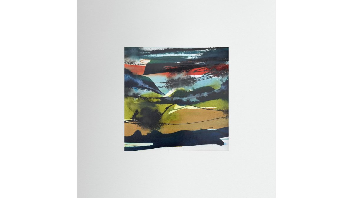
The Scottish Glen canvas print from Cairngorm Artists works well as a living room focal point, with warm reds and ochres meeting cool greens and blues. The layered brushwork suggests rolling hills and shifting light, bringing authentic Highland energy to your space.

Matching Scottish Art Colors with Your Room Palette
Build a visual conversation between Scottish art and your room's existing colors rather than forcing exact matches.
Scottish art typically features earth and sky tones, deep reds, warm ochres, forest greens, slate blues, and storm grays. When you hang a piece, you're introducing those tones into your color scheme, so consider what already exists in your room.
Neutral walls make Scottish art the primary color statement. Deep blues and greens cool the room and create calm. Reds and ochres warm it and add energy. Abstract Scottish landscape art often combines both, giving you flexibility.
Colored walls call for Scottish art that shares at least one tone. A terracotta wall pairs with warm earth tones and rust-red accents. A sage-green wall works with art echoing that green alongside blues and grays.
Furniture and textiles matter equally. A gray sofa with deep-blue pillows pairs with Scottish art in those same tones. A cream sofa with warm taupe curtains calls for warm-toned art.
Repeat at least two colors from your Scottish art elsewhere in the room, on a pillow, rug, frame, or shelf, so the artwork feels part of a complete design rather than isolated.
How to Hang Artwork at Home: Placement and Height
Where you hang Scottish art matters as much as what you hang. Proper placement determines whether the piece feels integrated into your room or like an afterthought.
Eye level is the golden rule. For most people, eye level is 57-60 inches from the floor to the center of the artwork. Hanging art at this height creates an immediate visual connection.
Measure 57 inches from the floor and mark that height. For 24-inch artwork, the frame top reaches 69 inches; for 36-inch artwork, 75 inches. This keeps the artwork centered on the viewer's natural line of sight.
Above furniture like a sofa or console table, follow the 8-12 inch rule: leave 8-12 inches of space between the top of the furniture and the bottom of the frame. This creates breathing room and prevents the artwork from feeling cramped or floating too high.
For hallways and narrow walls, keep artwork centered horizontally and at eye level vertically. Hallway art works best when it's slightly smaller than living room pieces, 18-30 inches wide rather than 36+ inches, so it doesn't overwhelm the narrow space.
Avoid these common mistakes: hanging artwork too high (most frequent error), too small for the wall, off-center horizontally, or at inconsistent heights in gallery walls.
Use a level to ensure frames sit straight; even a 2-degree tilt changes how the piece feels. Use painter's tape to outline the frame first and live with it for a day before drilling holes.
How to Arrange Art on a Wall: Gallery Walls and Groupings
Gallery walls bring Scottish art to life through intentional arrangement, offering multiple ways to display Scottish art across your walls. Group 3-8 smaller artworks to create a dynamic, curated display where each piece can highlight a different region or season of the Highlands.
Grid arrangement is the most controlled approach. Select same-sized frames spaced evenly (6-8 inches apart) in a 2x3 or 3x2 configuration. Consistent spacing lets each piece breathe while the collection feels unified.
Salon-style arrangement is more organic. Mix frame sizes and artwork dimensions while maintaining consistent 6-8 inch spacing. The variety feels curated rather than chaotic because the spacing remains consistent.
Scottish Glen - Fine art print from original artwork →
Linear arrangement lines artwork horizontally or vertically at eye level, spaced evenly. This works for narrow hallways and suits smaller Scottish art prints in entryways or bedrooms.
To plan a gallery wall, lay frames on the floor and arrange until balanced. Use painter's tape to outline positions on the wall, matching your floor layout. This removes guesswork before drilling holes.
Consistent 6-8 inch gaps between frames create visual rhythm. Varying gaps feel accidental. Deliberate spacing makes the wall read as a curated collection.
Scottish Wall Art Ideas for Different Rooms
Scottish art transforms differently depending on the room. Each space calls for different scales, styles, and color palettes to work effectively.
Living rooms benefit from larger statement pieces or gallery walls with deep blues, stormy grays, and dramatic landscapes. A single large piece or 3-5 piece gallery works best. The Scottish Hillside canvas print creates visual depth and movement with deep reds, earthy greens, and stormy clouds.

Bedrooms work better with smaller, calmer Scottish art. A single medium-sized print or pair of smaller matching pieces flanking the bed creates balance. Warm earth tones and gentle landscapes promote restful feelings.
Home offices need medium-sized Scottish art that inspires focus without distraction. Abstract landscapes or pieces with strong compositional lines create visual interest while maintaining professionalism.
Hallways and entryways suit smaller Scottish art in linear or salon-style galleries. Choose warm-toned landscapes or Highland wildlife pieces that feel welcoming.
Kitchens and dining areas work well with smaller to medium prints, often in pairs or groups of three. Lighter Scottish art or pieces with brighter accents feel appropriate in these active spaces. Avoid very large statement pieces that compete with the functional elements of the room.
Room size determines scale. Small rooms (under 100 square feet) suit artwork 18-30 inches wide. Medium rooms (100-250 square feet) work with 24-36 inch pieces. Large rooms (250+ square feet) can handle 36-48 inch pieces or gallery walls with multiple larger frames.
Framing, Protection, and Display Best Practices
How you frame and protect Scottish art determines how long it lasts and how effectively it displays. Proper framing transforms a print into a finished piece that elevates any room.
Frame materials matter. Wood frames echo Highland materials: light wood (oak, ash) works with cool-toned art, dark wood (walnut, mahogany) with warm-toned art, and metal frames with abstract work.
Matting creates breathing room between artwork and frame. A 2-3 inch mat adds sophistication and protects edges. Use neutral colors (white, cream, light gray) unless intentionally echoing artwork colors.
Glass and acrylic protection differ. Regular glass is affordable but reflects light. UV-protective glass reduces fading, important for direct sunlight. Acrylic is lighter but scratches easily.
Acid-free materials ensure longevity. When framing Scottish art, request acid-free backing paper, mats, and mounting supplies. Acidic materials yellow over time and can damage the artwork.
Hanging hardware should match your wall type. Drywall anchors work for most homes; use two anchors per frame for pieces over 20 pounds. Plaster walls need toggle bolts.
Protection from light and moisture extends the life of Scottish art. Avoid direct sunlight, which fades colors. Keep artwork away from bathrooms and kitchens where humidity fluctuates.
The Scottish Glen fine art print from Cairngorm Artists arrives ready to hang in a handmade Italian wooden frame with acid- and lignin-free paper and textured matte surface, preserving vibrancy and depth for decades.

Choosing and displaying Scottish art brings the spirit of the Highlands into your daily life.
At Cairngorm Artists, we believe every piece of Scottish art tells a story of the landscape and the artist's connection to it.
Frequently Asked Questions
How high should you hang Scottish art on a wall?
The center of your artwork should hang at eye level, approximately 1.5 metres from the floor. This standard applies whether you're displaying a single piece or a gallery wall arrangement. For artwork above furniture like a sofa, position it 20-30 centimetres above the furniture's top edge to create visual balance. Adjust slightly based on ceiling height and room proportions, higher ceilings may warrant slightly higher placement to maintain visual harmony.
What size Scottish art works best above a sofa?
Choose artwork that covers roughly 50-75% of your sofa's width for visual proportion. For a standard three-seater sofa (around 2 metres wide), artwork measuring 1-1.2 metres wide creates ideal balance. If hanging multiple pieces, ensure the combined width fills this range. Canvas prints and fine art prints from Cairngorm Artists come in various sizes to suit different furniture scales, and their ready-to-hang frames eliminate guesswork about presentation.
How do you display Scottish art in a small room without overwhelming the space?
In smaller rooms, choose one focal-point piece rather than multiple artworks competing for attention. Select artwork with cooler tones or lighter backgrounds to avoid visual heaviness. A single canvas print or fine art print positioned above a key furniture piece creates impact without clutter. Keep frames simple and consistent with your room's existing finishes. Lean smaller pieces on shelves rather than covering wall space, creating visual interest while maintaining openness.
How do you know if Scottish art will match your existing home decor?
Identify your room's dominant color palette, walls, furniture, and major accessories. Look for Scottish artwork that either complements these colors or introduces a cohesive accent tone. Landscape and abstract Scottish art often features earth tones, deep blues, and greens that work with traditional, contemporary, and modern interiors. Consider the frame finish (wood, metal) and ensure it coordinates with existing furnishings. Many collectors find that authentic Highland-inspired pieces naturally integrate with homes featuring natural materials like stone and wood.


